Scaling ecommerce navigation
THE ICONIC, 2020 – 2021THE ICONIC is Australia’s #1 online fashion store. With a growing assortment of products and outdated patterns, As an in-house designer, I worked to improve navigation to make it easier for customers to find what they are looking for.
Problem
In addition to growth and discoverability issues, our mobile (both app and web) interface patterns were outdated and not designed for the current breadth of products sold by THE ICONIC. This meant that customers didn’t even realise we sold some of the items we did.
My work as a designer on this project was across four main themes:
- UI - The existing solution simply couldn't handle the assortment growth. This was particularly bad on mobile where customers weren't even aware of some of the categories we offered due to the UI.
- IA - Making sure that customers can easily find what they're looking for when they know what they want, or are just browsing. I used both quantitative and qualitative methods to refine how our navigation was structured.
- Internal process - Different departments such as marketing, category, and tech often had conflicting goals of navigation. I worked closely with my Product Manager to understand these and design a solution that struck the right trade-offs. This also included future processes for making changes to the nav.
- Technical solution - Whilst engineering owned this side of things, I had to work closely to make sure the backend could support a variety of visual and hierarchical differences in navigation across web, iOS, and Android.
Web desktop navigation (early 2020, before this project)
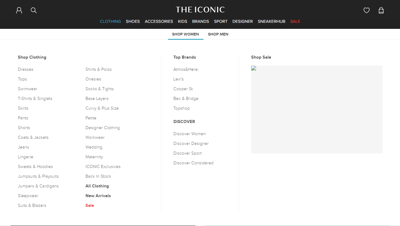
Web desktop navigation (after this project, note the growth in assortment)
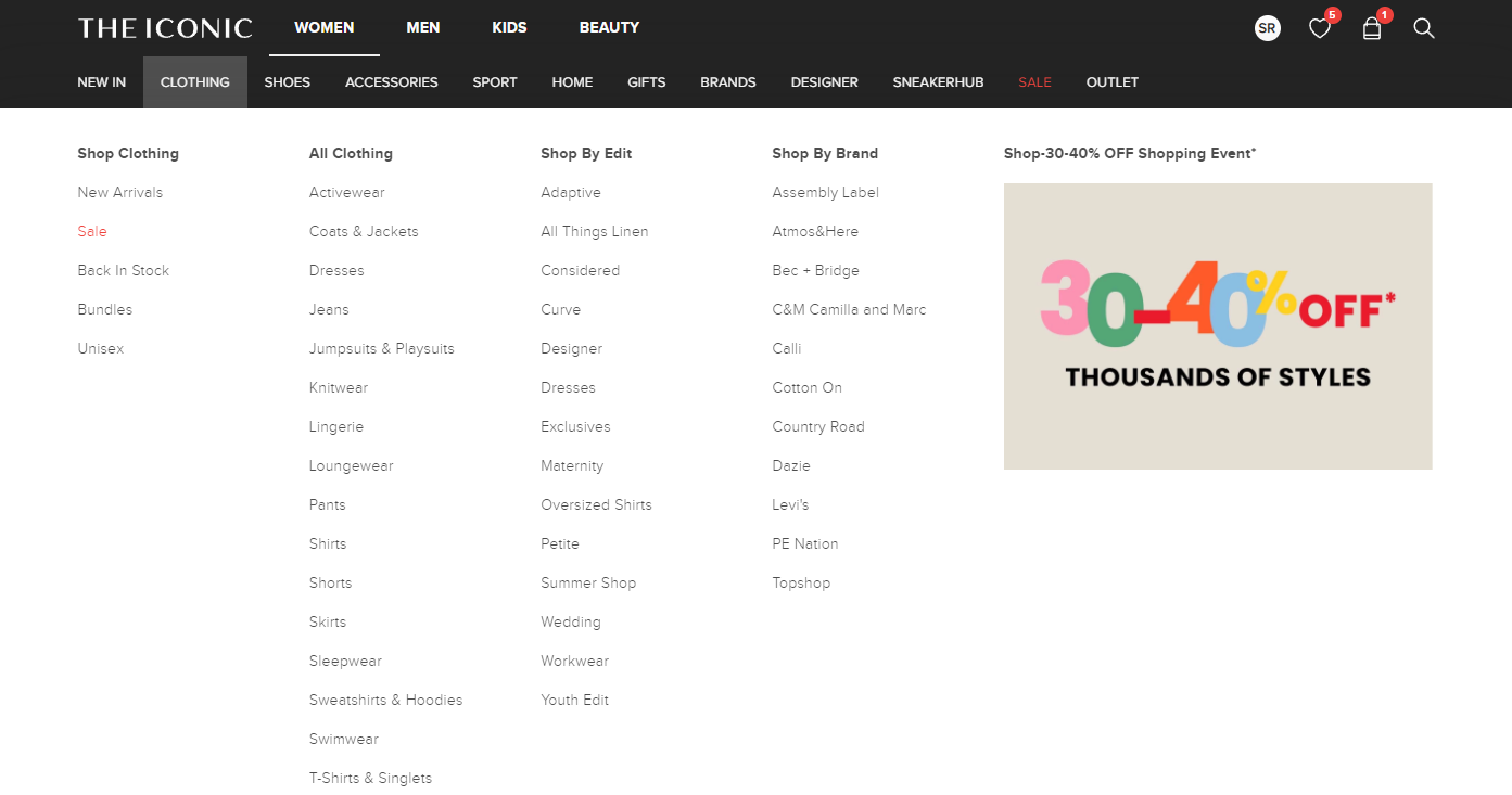
Mobile web navigation (before)
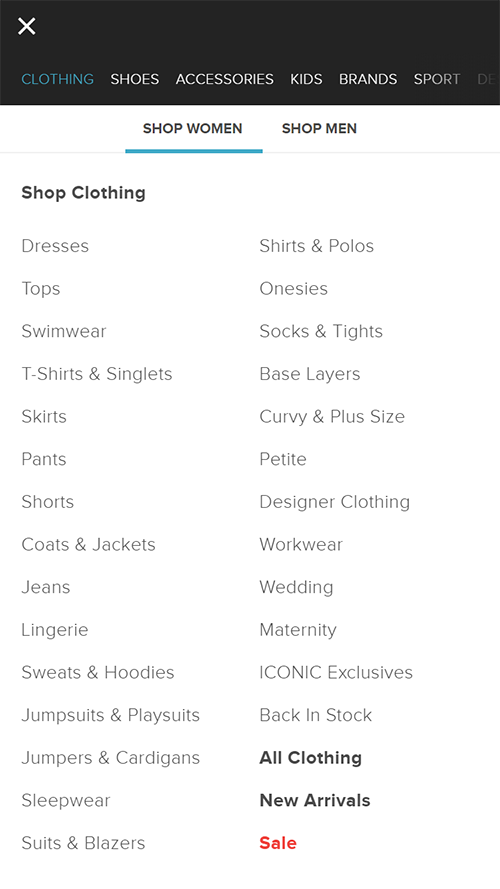
Mobile web navigation (after)
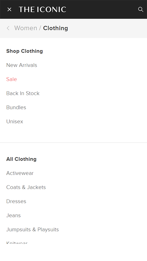
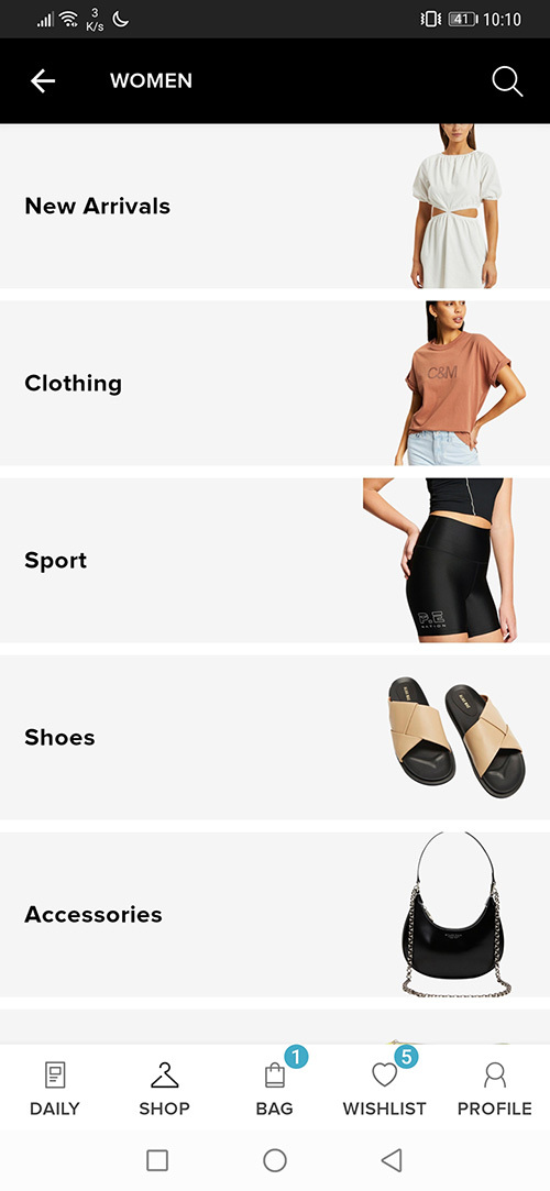
Android navigation (before)
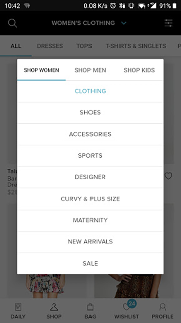
Anrdoid navigation (after)
Top design challenges and constraints
- Balancing what’s best for user navigation vs business and trade needs. For example we may be trying to promote a certain category or sale, but when are the times we should or shouldn’t do this? How far can you push this before your navigation feels more like an ad than helpful wayfinding?
- Balancing navigation “width” (how many categories to show) with “depth” (how many sub-categories can be navigated). For example what are the pros and cons of a low width + high depth model compared to a high width + low depth model.
- Users who know what they want VS those who are exploring. How do you create navigation that solves for these two different contexts?
- Certain navigation patterns favour different levels of scale. What you would use for a department store is very different from a small boutique that only has a few categories. Our scale was in a middle ground bordering on department.
- Internal stakeholders might have their own sales targets and understandably prefer if their category has more prominence in navigation. How do we help teams understand the appropriate visibility and priority of their category?
- Designing for current problems faced by navigation as well as keeping in mind future challenges. For example, at what point of assortment scale would we switch UI patterns to handle greater scale?
- Small working group of myself, a product owner, and 2 engineers. No in-house dedicated researchers. There was no fixed deadline (good thing) but knew we were leaving customers with a subpar experience in the meantime, so there was a medium-high level of urgency.
Process and solution
Brief summary of steps taken to get there, followed by a more detailed explanation of why and how these were taken:
- Audit of existing links across all platforms to establish a baseline
- Competitor and non-competitor research, specifically looking at how navigation patterns changed based on the size and scope of their product offering.
- Meet with internal stakeholders to understand their expectations, needs, and any future category growth
- Explore different ‘modes’ of navigation (expanded upon later)
- Split into two streams: figuring out the best UI patterns, figuring out the navigation information architecture (IA)
- Prototyping, testing
- Synthesising previous findings into ‘navigation principles’ document to be agreed upon by stakeholders including executives and CEO.
- Mobile web production code built, A/B tested at 10% traffic
- With success, mobile web roll out to 100%
- App, desktop versions rolled out
- Internal process formed for navigation update requests (as the links need to be updated as stock arrive or campaigns launch)
- Ongoing monitoring and iteration
Navigation was the first major project I worked on at THE ICONIC about 4 months in after joining. Whilst we hadn’t had too much direct customer feedback that there were major navigation issues, it was clear that we had outgrown our existing interface, particularly on mobile. Since navigation is such an important part of an ecommerce site, it was important to make this also about the broader problem of way finding and information architecture.

Like any classic UX project of improving an existing system you gotta do an audit and competitor review to get a baseline of where things are. This mainly helped to understand how a lot of ecommerce navigation is shaped around the depth and breadth of that provider's assortment. A service that has 50 categories has much different navigation needs to one that only has 3.
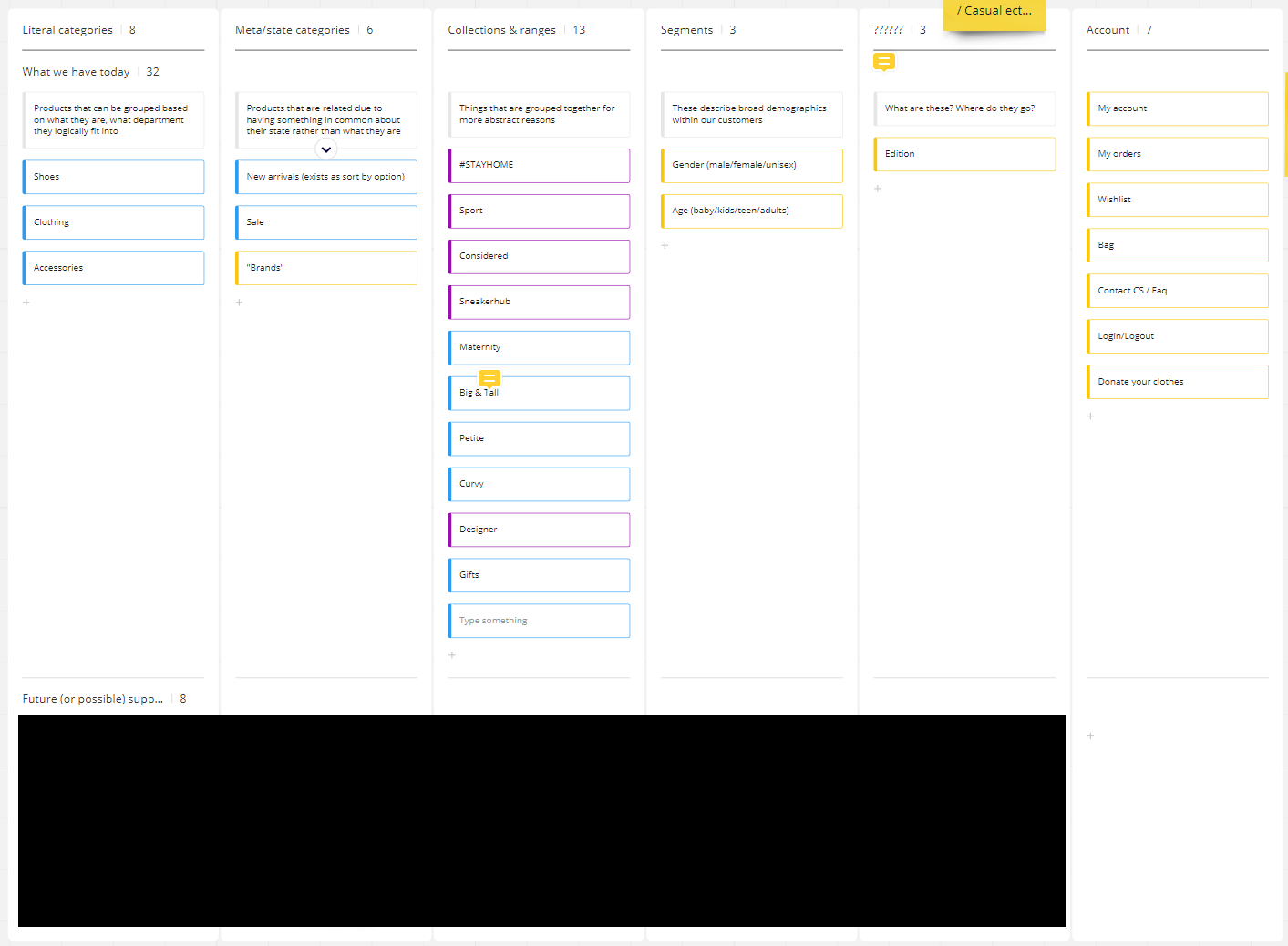
Apart from user interface differences, the nav had quite different category structures depending on whether you were visiting from your desktop computer or using our apps. One used a gender followed by category (e.g. clothing, shoes, accessories) approach, the other used the opposite. Either technique has pros and cons, but being internally inconsistent was unnecessary. We ended up going with the gender-first approach which does sometimes raise some socio-gender concerns, but it most aligned with how the majority of customers prefer to shop for fashion items. We also were aware that we would in the future be growing into categories that were separate from gender (e.g. homewares, beauty products).
Any solution we came up with needed to be a marriage of the needs of the two main customers of nav – our actual customers, and our category management team (responsible for our stock). If it works for customers but not internally it isn’t a complete success.
Jumping ahead to step 4 – exploring modes of navigation, we knew that visitors came to our site with a variety of contexts and needs. Designing for 1000 use cases is not helpful, so a useful level of abstraction is to design for two main funnels:
- People who know exactly what they are after, “I need some black and white high top converses”
- More exploratory searching which can be somewhat specific “I need a dress for my friend’s wedding”, or more open “I’m just bored and want to browse”.
The navigation ended up mainly optimising for the first case, but has some room for the second type through links to "edits' which are curated content such as "Trending looks". There were also other parts of our product where we could meet the needs of more browsing-based behaviour (such as our news feed on the apps)
One exploration involved three IA models for how navigation could work:
- Segment based – you start with the ‘who (gender/demographics)’, followed by the ‘what are you shopping for’
- Category based – start with the ‘what are you shopping for’, followed by ‘who’
- Behavioural based – start with why are you here, followed by ‘what are you shopping for’
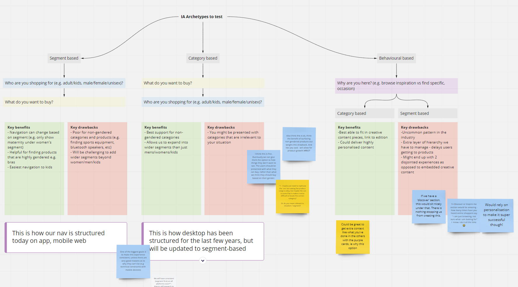
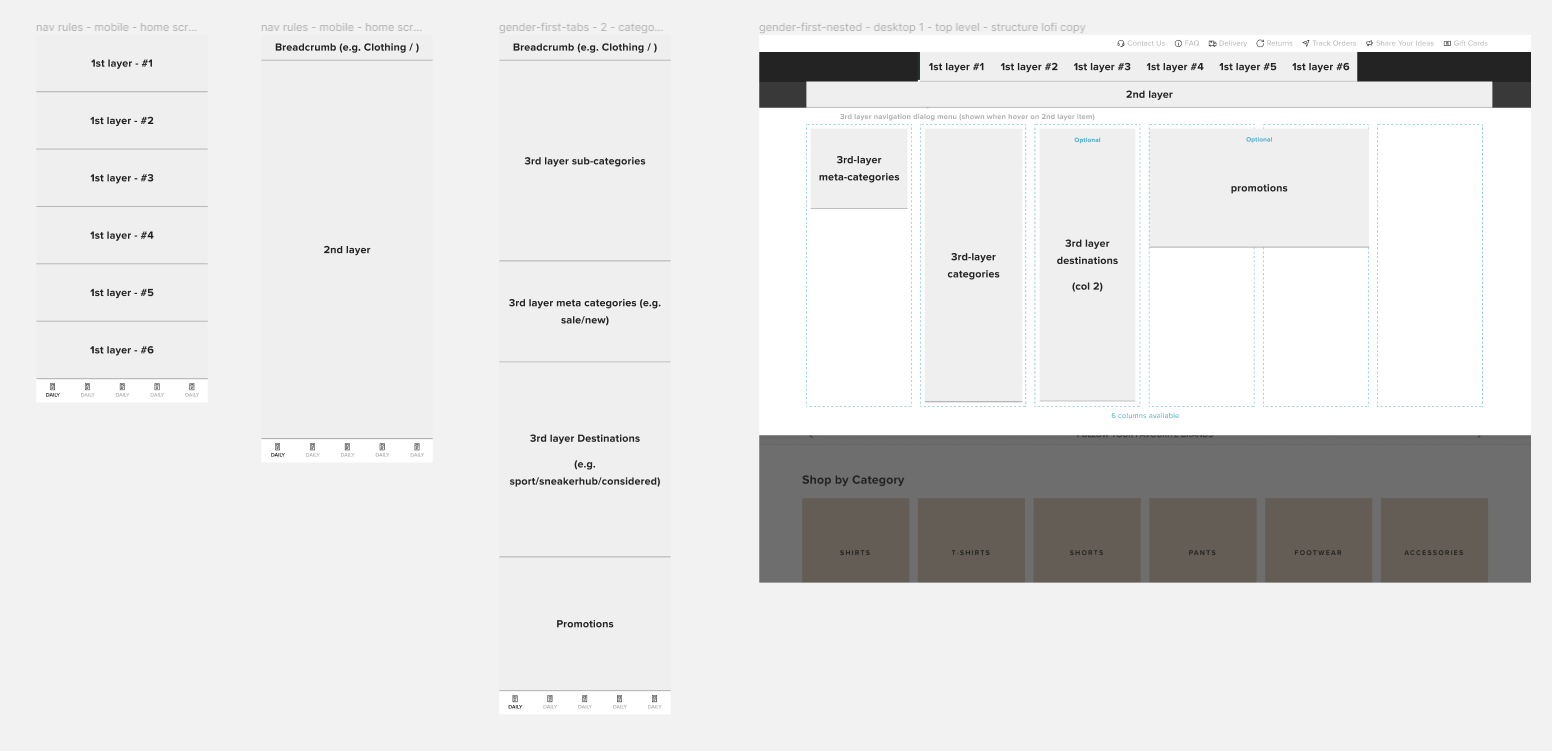
The behavioural based version offered the biggest departure from the current navigation, and wasn’t something we really saw in the commerce world. That represents either a major opportunity, or risk as standard patterns can help users too. Whilst that was bubbling away from an IA perspective, I investigated navigation patterns for both mobile and desktop. Sometimes I think designers can be too strict with trying to nail the big picture before jumping to some of the details. I’ve found that often one can influence the other.
Above, I am exploring how different levels of navigation would be represented across mobile vs desktop. It was important to me to have a consistent hierarchy even if the UI patterns were suited for the platform.
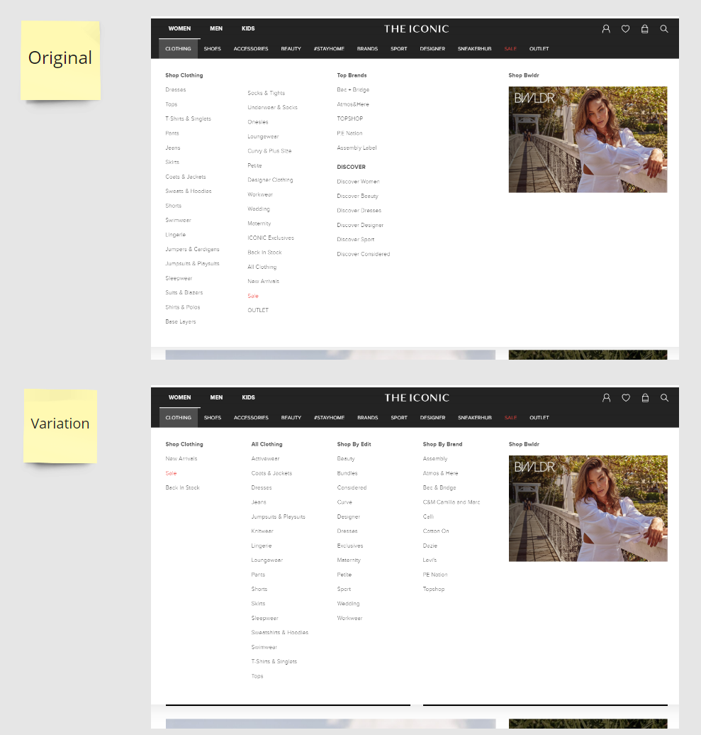
In a later experiment, we solved a problem with the “level 3 links” (in the white area) where we mixed actual categories with meta categories in the same list. We had the hypothesis that by separating these out, as well as making the list alphabetically sorted instead of priority sorted we would improve conversion. The results were interesting in that they didn't show a significance difference in click through rates, but had overwhelming qualitative support.
I also created guidelines for animations and transitions for our mobile navigation. At this stage animations weren’t part of our design system so I worked with our main front-end engineer to include the timings as tokens.
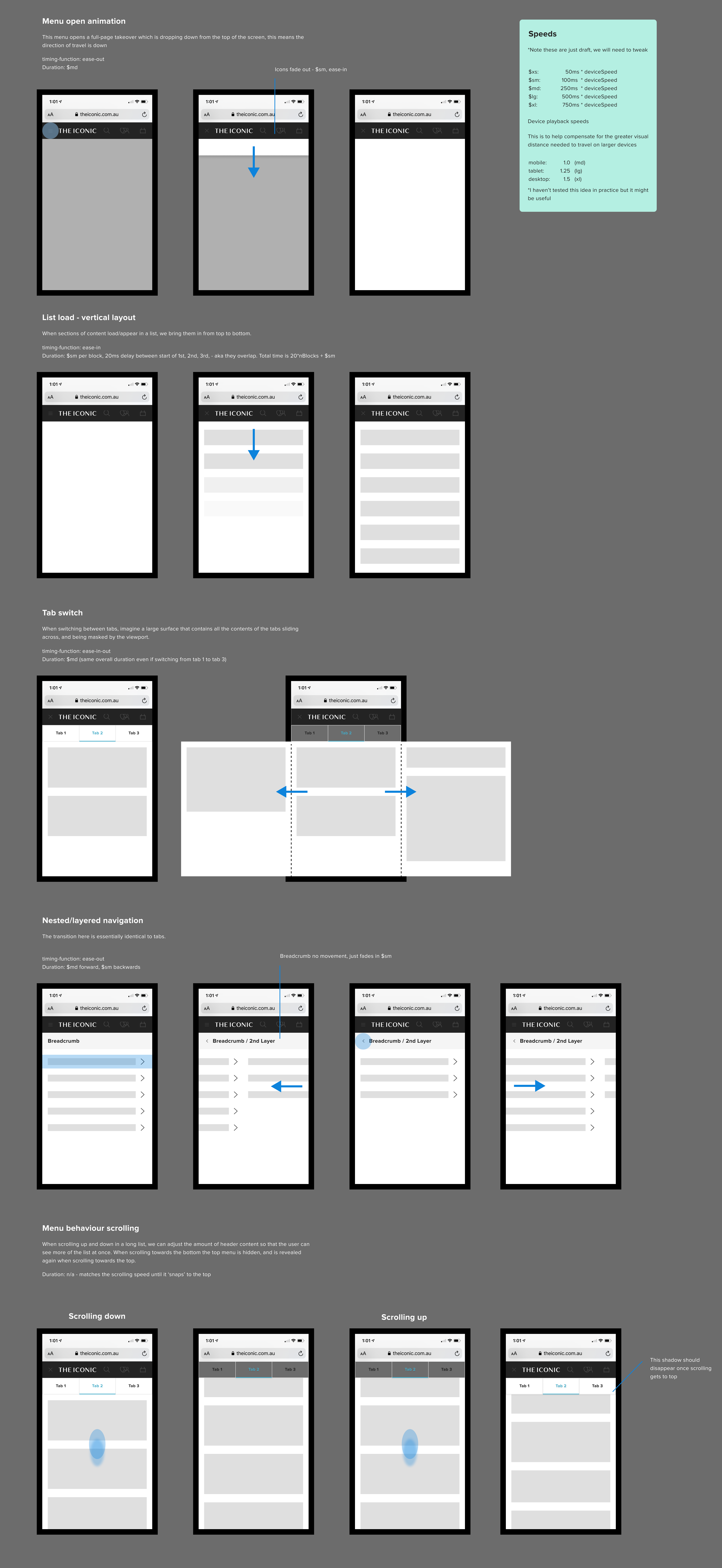
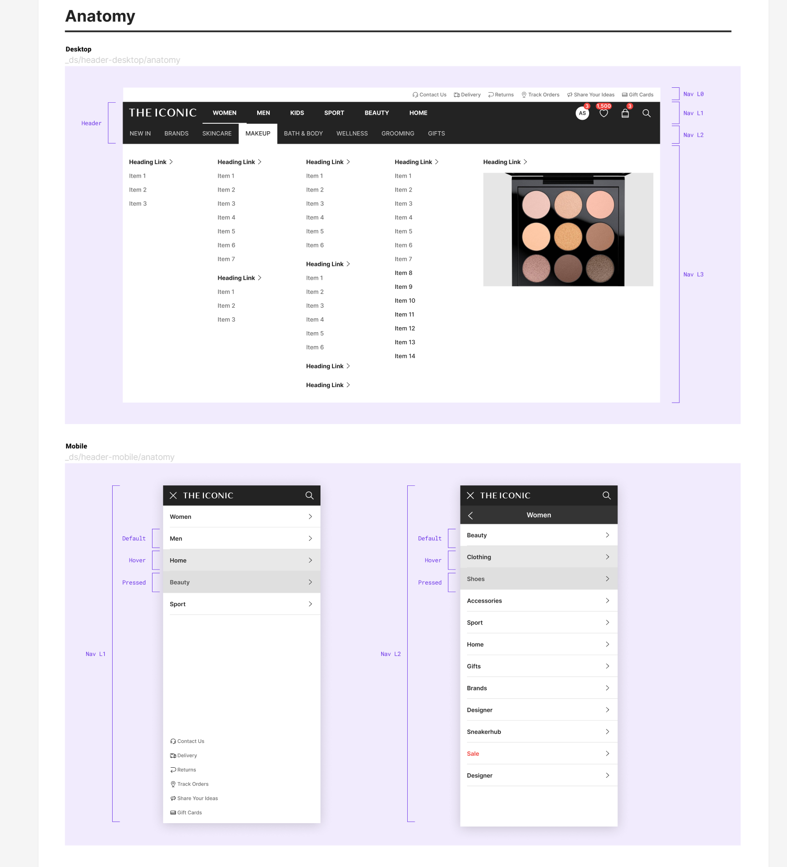
After internal testing, we ended up dropping the list loading effect as it was more distracting than anything else and didn’t add much to the experience. The other animations (subjectively) helped with understanding traversing the layers of navigation. Post-rollout it was important future stakeholders knew how to update the navigation as well as what layouts were wasn’t allowed. This consisted of three parts
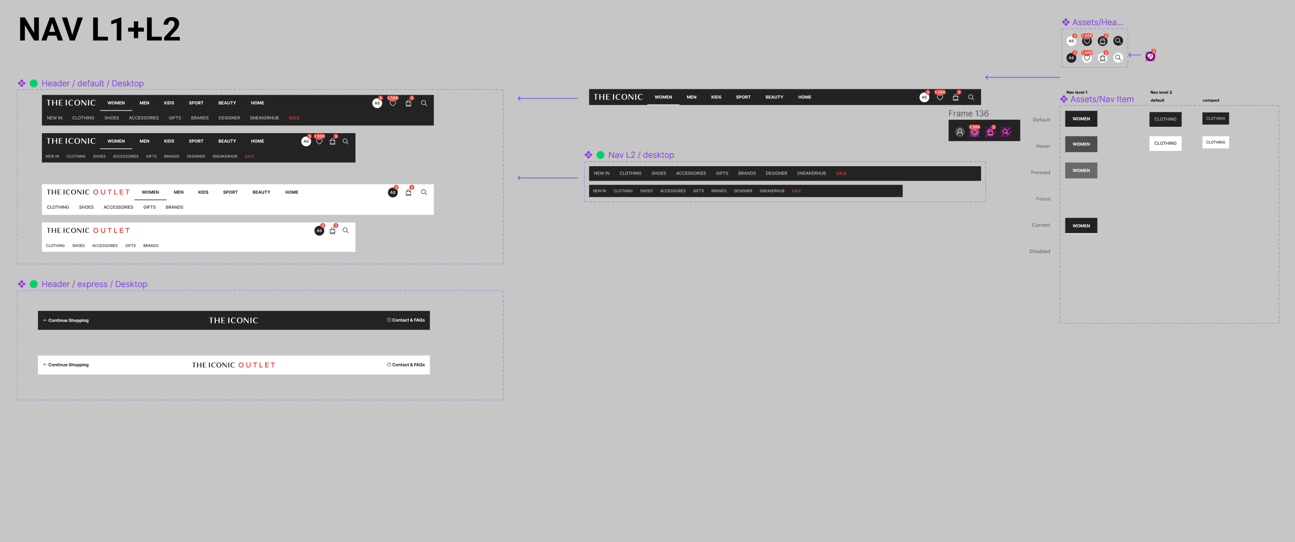
- A visual guide of navigation templates in our online whiteboard miro (shown below)
- An internal specification document that outlines the rules, limits, priorities of nav
- A clear spreadsheet template that is actioned weekly where category managers can add/edit/delete URL links. Ideally we wanted to create a self-service tool for this however due to prioritisation constraints we had to move onto other things.

This document was made in collaboration with the primary navigation stakeholders in marketing and category management has been very useful to socialise what is and isn't allowed in the nav.
Navigation is an ongoing project of any product so I would never consider it ‘finished’ however I think we did a great job of improving what we had, and setting ourselves up for the future by thinking of our navigation as a living breathing thing and not just a one-and-done project.

Success measurement
Early in the process of defining success criteria, I like using a technique like ideal/inverse matrix to paint a story of what success and failure would look like. This also works really well in a workshop context where you might have people unfamiliar with statistical theory as storytelling is universal.
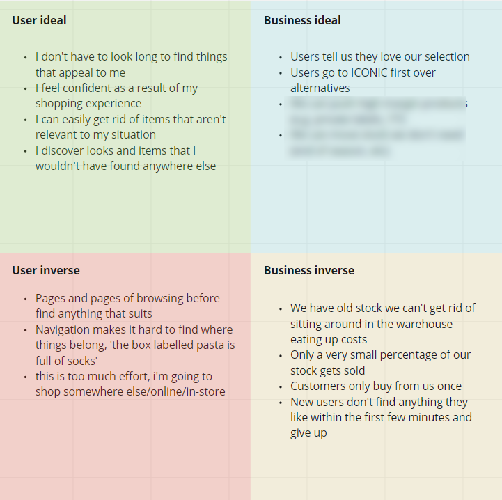
Navigation is hard to pin down to just one metric, so success was measured through a range of lenses. These metrics were defined between a working group of myself, the product owner, and the engineering lead.
Primary metrics
- Qualitative ‘findability’ of key journeys (e.g. task success, error rates, card sorting correctness)
- % of navigation journeys that end with viewing a product. For example if a menu open is triggered, a great nav should help a customer find what they are looking for and they will land on a product page. A poor navigation would have users bouncing around all over the place trying to find something, and may just give up.
- Sales metrics – revenue, average basket value, average basket size. Needed to make sure that any IA changes didn’t have a negative effect on bottom line. Just-as-good or better was enough for this project.
Secondary metrics
- Time to deploy navigation changes & fallback when needed.
- Category click through rates - is there a link in the navigation that very few users are clicking? Maybe this is a sign that there is not much desire for this kind of product, or that customers don’t understand what it means.
Reflection
Looking back on this project there are a few things I would do differently. I had originally thought going into this that figuring out the UI or IA would be the hard part. It turned out to be neither of these. Creating alignment in what to prioritise in the navigation across different stakeholder groups ended up being it. Whilst I did work with my PM early to speak to all these teams, if I had to do it over again I would much spend more time earlier bringing these groups together, rather than acting as a centralised mediator.
Secondly, when it came to setting expectations of the goals of the project with others, one or two things were under or over sold. We undersold to stakeholders the enablement aspect of the project - the ability to quickly deploy and monitor A/B tests with the navigation. It took some time before this became known. What was oversold (simply because we didn't know this at the time) was that some of the quirks of navigation customers were running into had root causes that ended up being the way products were tagged in the system. In other words it wasn't a broken link, it was incorrect categorisation in the first place. Whilst we did spend some time investigating existing tech debt, more attention to peeling back the process of how products end up in the navigation would have helped us catch this earlier.